How To Calculate Custom Rankings for a Points League: Part 5 – Calculating Projected Points

Welcome to the first part of a series in which we’ll go step-by-step through the process of using Microsoft Excel to calculate your own rankings for a fantasy baseball points league (as opposed to rotisserie or head-to-head rotisserie).

Whether you’re in a standard points league at a major site like ESPN or a more advanced Ottoneu league at Fangraphs, this process will help you develop customized rankings for your league.  These instructions can be used for a season-long points league or a weekly head-to-head points league.

If you’re looking for info on how to rank players for a roto league, look here.

I recommend going through all the parts of the series in order. If you missed an earlier part of this series, you can find it here:

ABOUT THESE INSTRUCTIONS

  • The projections used in this series are the Steamer 2015 preseason projections from Fangraphs.  If you see projections that you disagree with or that appear unusual, it’s likely because I began writing this series in December 2014, still early in the off-season.
  • For optimal results, you will want to be on Excel 2007 or higher.  Some of the features used were not in existence in older versions.
  • I use Excel 2013 for the screenshots included in the instructions.  There may be some subtle differences between Excel 2007, 2010, and 2013.
  • I can’t guarantee that all of formulas used in this series will work in Excel for Mac computers.  I apologize for this.  I don’t understand why Excel operates differently and has different features on different platforms.

IN PART 5

In this part of the series we will use the named cells created in Part 2 along with our projection information on the “Hitter Ranks” and “Pitcher Ranks” sheets to calculate total projected points for each hitter and pitcher.

Please note that this series has been adapted into a nine-part book that also shows you how to convert points over replacement into dollar values and how to calculate in-draft inflation. Click here if you’re interested in reading more about the conversion to dollar values.

EXCEL FUNCTIONS AND FORMULAS IN THIS POST

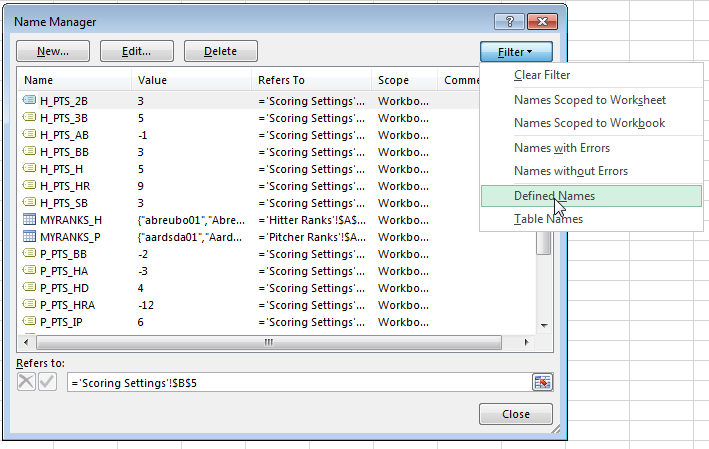
We’ll just be doing some basic addition and multiplication.  We won’t be adding in any new features, but we will be doing this basic math using the named cells for your league’s scoring settings that we created in earlier parts of the series.  All_Point_Values
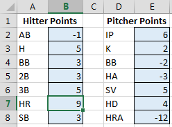
To refresh your memory and to see the complete list of named cells, access the “Formulas” tab of the Ribbon and then click the “Name Manager” button.Name_Manager

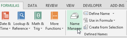
The list will display all named cells/ranges and named tables.  To view only named cells, click on the “Filter” drop down menu and choose “Defined Names”.Defined_Names

STEP-BY-STEP INSTRUCTIONS

Continue reading “How To Calculate Custom Rankings for a Points League: Part 5 – Calculating Projected Points”

How To Calculate Custom Rankings for a Points League: Part 4 – Pitcher Rankings

Welcome to the first part of a series in which we’ll go step-by-step through the process of using Microsoft Excel to calculate your own rankings for a fantasy baseball points league (as opposed to rotisserie or head-to-head rotisserie).

Whether you’re in a standard points league at a major site like ESPN or a more advanced Ottoneu league at Fangraphs, this process will help you develop customized rankings for your league.  These instructions can be used for a season-long points league or a weekly head-to-head points league.

If you’re looking for info on how to rank players for a roto league, look here.

I recommend going through all the parts of the series in order. If you missed the beginning of this series, you can the earlier parts here:

ABOUT THESE INSTRUCTIONS

  • The projections used in this series are the Steamer 2015 preseason projections from Fangraphs.  If you see projections that you disagree with or that appear unusual, it’s likely because I began writing this series in December 2014, still early in the off-season.
  • For optimal results, you will want to be on Excel 2007 or higher.  Some of the features used were not in existence in older versions.
  • I use Excel 2013 for the screenshots included in the instructions.  There may be some subtle differences between Excel 2007, 2010, and 2013.
  • I can’t guarantee that all of formulas used in this series will work in Excel for Mac computers.  I apologize for this.  I don’t understand why Excel operates differently and has different features on different platforms.

IN PART 4

In this part of the series we will again use Excel’s VLOOKUP and IFERROR formulas as well as Table and Structured Reference features, but this time to pull pitcher information and projections to create our pitcher rankings tab.

EXCEL FUNCTIONS AND FORMULAS IN THIS POST

This is where I normally give detailed explanations of each Excel feature and formula used in the instructions below; however, we’re not introducing anything new in Part 4. If you would like more background on the features and formulas used below, please refer to Part 3 or ask questions in the comments area below.

STEP-BY-STEP INSTRUCTIONS

Continue reading “How To Calculate Custom Rankings for a Points League: Part 4 – Pitcher Rankings”

How to Use Excel to Determine Replacement Level

Who is the replacement level shortstop in a 12-team league that starts one shortstop and one middle infield position?

We know there will be at least 12 shortstops drafted in this scenario.  But will there be 15, 16, 17, 18, or more drafted?  And where does that put the replacement level shortstop at?

This concept of replacement level has always been a little bit of a problem for me.  In my original series about ranking players, I mentioned that in this 12-team scenario, that we would have 36 combined 2B and SS drafted, and to simplify things we could assume that would be 18 second basemen and 18 shorststops.

But that’s not a precise enough answer.

If we’re trying to squeeze every drop of value from our drafts, we should determine precisely who the replacement level player is at each position.  After all, replacement level is a huge driver in the calculation of a player’s value.

So we need to get it right.

What You Can Expect

I’m going to show you a system I’ve started using that will help you identify:

  • The starters at each position (e.g. top 12 1B, top 60 OF, etc.)
  • The corner and middle infielders (the next 12 best 1B/3B and 2B/SS)
  • The 12 utility players (the next 12 best players at any position)
  • The replacement level player at each position

The system is very easy to do.  I was forced to come up with it out of necessity when I was working on my recent analysis of the past five years of draft results.  For that post I had to calculate projected and actual dollar values for each of the last five seasons. So I needed a fool-proof method for determining replacement level 10 times in a short period of time and I also wanted to be able to come back to each set of data and easily be able to tell what group each player fell into.  Thus the color coding.

Replacement_Level
Here’s a little taste of what we’re going to do. I’ll show you a process that will take you only a few minutes to color code and clearly document players into groups of Starters, CI/MI, UTIL, and Replacement Level.

Excel Features You Should Know

There are three pretty neat features of Excel that I used during this process that you may not be familiar with, and they might be able to save you a lot of time: Continue reading “How to Use Excel to Determine Replacement Level”

Analyzing the Last Five Years of Rotisserie Baseball Drafts

How many of the top hitters and pitchers at the end of the year were actually drafted? How many of the top hitters and pitchers were not drafted and were picked up during the season?  Were hitters or pitchers drafted more accurately?  What is the dollar value earned by the players that were picked up during the season?  Is there a position of hitter that’s more reliable than other positions?

Have you ever asked yourself draft analysis questions like these?

What follows is a five year analysis (with colorful graphs and an enormous Excel file!) of how accurately our projections in the preseason depict what has actually happened at the end of the season. How well we drafted.  What positions yield the best returns.  What positions offer the most free loot.  And more.

Assumptions You Should Know

A number of the graphs depend on dollar value earnings for the “top 168” projected hitters or “top 108” projected pitchers.  The dollar values are calculated using the approach documented in “Using Standings Gain Points to Rank and Value Fantasy Baseball Players” assuming a 12-team league, $260 team budget, 14 hitters (C, C, 1B, 2B, SS, 3B, CI, MI, OF, OF, OF, OF, OF, UTIL), 9 pitchers, and a 70%-30% hitter-to-pitcher allocation.  That’s a total of 168 hitters and 108 pitchers.

These top projected players in the preseason were determined using Steamer’s preseason projections for that season (I downloaded the historical projections here).

I suppose using ADP results or expert rankings from the given year might give a better picture of the players that were actually drafted, but then you get into the question of what’s good ADP data, where to get it, what experts to use, league differences, lineup differences, etc.

To Be Clear…  The Goal of this Study

The goal of this is not to measure the accuracy of particular experts.  It is to determine which positions can we draft and get the most return on our investment.  To some extent this is a review of Steamer’s accuracy, but that’s also not my intent.  It’s my understanding (tell me if I’m wrong) that there are not significant differences between the top projections systems.  So whether we were looking at PECOTA, Steamer, or Marcel projections, we would see similar results.

How Much of a Return Do We Get For Drafting HItters vs. Pitchers?

People have long been telling us to, “Load up on hitters early in the draft”.

“Don’t overspend on pitching.”

“Wait on pitching until most teams already have one.”

I’ve always heard these things.  They sounded right.  But I can’t say I’ve ever seen the data to support it.

In looking at the chart below it is very clear that we are much better at identifying the top hitters than the top pitchers.  The top 168 hitters in the preseason provide about 70% of the dollars earned at the end of the season.  For pitchers, it’s more in the neighborhood of 40%.

With results like that it’s very easy to see why the hitter-pitcher split is not 50-50.

Hitters are safer investments than pitchers.  We’ve always been told this, but now you can see it.  And things have not changed in the new era of pitching that we’ve been seeing the last few years.  If anything, the gap seems to have widened.

Hitter-Pitcher-Draft-Returns-With-Losses
In a draft and hold environment, the return on investment for drafting hitters fluctuates between 65% and 80%. The return on pitchers is much lower, falling roughly between 30% and 50%.

Continue reading “Analyzing the Last Five Years of Rotisserie Baseball Drafts”

Use PITCH f/x Data To Identify Potential Breakout Pitchers (Part III)

If you’ve made it to Part III in the search to identify potential breakout pitchers, congratulations.  If you missed them, you can find Part I here and Part II here.

Enough Talk, Where Is This List Of Potential Breakout Pitchers?

I’ve uploaded an Excel file to Microsoft Sky Drive.  You can edit, view, or download the file for your own uses.  It’s mostly the same data from the YouTube video, but I added a lot of bells and whistles.  A red cell indicates a pitch that has declined in use from 2012 to 2013.  A green cell indicates a pitch with more usage.  The color intensity indicates the magnitude of the change.  The links to the right take you directly to that specific player’s page on BrooksBaseball.net.

PitchClass14
Click on the image to be taken to the editable file (you can edit or download for your own use).

Disclaimer #1

Keep in mind, I started this analysis on June 24th, 2013.  So if you’re finding this information after that time, you may want to double-check the usage graphs for any pitcher you’re researching.  But I’ve tried to document the approach to doing this research in the video and other parts of this series.  You can perform this research at any time (it would be great if we could get monthly usage reports from Fangraphs, then we could do this in the offseason to identify pitchers who started to change their mix late in the season).

Disclaimer #2

You saw from Part II of this series that these changes in mix have to be taken with a grain of salt.  And even after you’ve verified that there is indeed a change in pitch mix, you still need to go review the effectiveness of the pitches being used more frequently.  I wish I could go through each of these pitchers and break them down for you.  But it’s just not practical (my two-year old and four-year old don’t find PITCH f/x research very entertaining).  Hopefully I’ve equipped you with the tools you need to go analyze these pitchers more closely.

For pitchers on your team, check them out.  If you’re thinking of picking up a free agent, check him out.  If your pitching staff is terrible and you need to find the next big ace, check them all out.

Conclusion

Granted, it’s a small sample size.  But I’ve done a deep look in this fashion for Edward Mujica, Max Scherzer, and Alexi Ogando.  And all show promising results.  There will certainly be pitchers that change their mix and it has little effect on their end results.  But this seems like a promising exercise.

PLEASE LET ME KNOW WHAT YOU THINK Or If You Have Questions

I realize this is quite involved.  It’s certainly more difficult than reading the weekly pickups columns that are out there.  But anyone can read those and snag players just as easily as you can.  This process will put you ahead of the curve, give you players to monitor, and give you first crack at picking them up.

Thanks and be smart.


Use PITCH f/x Data To Identify Potential Breakout Pitchers (Part II)

Picking up where we left off in the post “Use PITCH f/x Data to Identify Potential Breakout Pitchers“, now that we’ve identified the potential pitchers (link to pitchers with differences) who have added a new pitch or that have significantly adjusted their pitch usage mix in 2013, we need to determine if the new or more heavily used pitch is successful.

Before We Go Any Further

I think it’s important you read the article The Internet Cried A Little When You Wrote That On It, by Mike Fast (follow Mike on Twitter).  The whole article will be helpful if you’re trying to improve you understanding of PITCH f/x, but at least read bullet #1.

My takeaway from that piece is that significant changes in pitch mix, especially within the fastball classifications (FA, FT, FC, FS, SI), are most likely to be changes in the algorithm used to classify the pitch.

Take for instance, Jake Peavy.  The PITCH f/x data I downloaded from Fangraphs and manipulated to identify “potentially” new pitches, shows the following for Peavy:

PitchClass2

Interpreting that chart, from 2012 to 2013, the Fangraphs data shows a decrease in the fastball (FA) of 19.9% and increase in the two-seam fastball (FT) of 26.7%.  That sounds interesting on the surface, no?  Decrease one pitch 20% and increase another?

From Mike Fast’s article we know that we can’t necessarily trust the pitch classifications.  So let’s look at the 2012 velocity and spin on Peavy’s pitches:

PitchClass4
Click image to be taken to this page at BrooksBaseball.net

And the same for 2013:

PitchClass3
Click image to be taken to this page at BrooksBaseball.net

From these two charts you can see Peavy’s throwing the same pitches in 2013 that he was throwing in 2012.  The clusters are in the same general vicinity on the chart.  But more importantly, you can see there is very little difference between the fourseam (FA) and the sinker (BrooksBaseball calls the two-seam fastball a sinker (FT)).     So a 20% transfer from one classification to another is likely a change in the algorithm, as we were warned.

Give Me Someone Else to Look At

Alright, Alexi Ogando, although injured recently, has been intriguing.  The raw data shows a sharp decline in fastball usage and an increase in the changeup.  This probably isn’t just a case of an algorithm change (fastballs wouldn’t likely be misclassified as changeups).

PitchClass10

Let’s look at his 2012: Continue reading “Use PITCH f/x Data To Identify Potential Breakout Pitchers (Part II)”

Video: Use PITCH f/x Data To Identify Potential Breakout Pitchers (Part I)

I’ve talked before about the amazing tool we have at our fingertips in PITCH f/x.  I’ve also had two (Scherzer and Mujica) instances this season where I came across seemingly small anecdotes about a specific pitcher adding a new pitch, and the pitcher in question has gone on to have a “breakout” season thus far.  So I thought to myself…

Why Not Look For More Pitchers Who’ve Added A New Pitch

And rather than just share the results with you, I thought it might be more beneficial to share the method I used to do my search.  You know, the whole “teach a man to fish” proverb.

While there is a lot of great PITCH f/x data available at sites like Fangraphs and BrooksBaseball.net, I have not been able to locate a resource that allows me to do a year-to-year comparison of the data across a large pool of players (BrooksBaseball can show you great comparisons for a specific player).  So to identify these pitchers who have developed a new pitch, I had to download sets of data for 2012 and 2013 and apply some functions in Microsoft Excel.

I recognize that some of my posts get a bit lengthy and this process may have pushed the limits, so I’m trying something new and have put together my first YouTube video (if you’re interested in being notified of future videos, click here to subscribe to the SFBB YouTube channel).

About The Video

The video is approximately 15 minutes long, and takes you through a step-by-step process to download PITCH f/x pitch usage data from Fangraphs.com, pull the data into Excel, match up 2012 and 2013 pitch usages, calculate a difference in pitch usage, use the calculated difference to target players that are most likely throwing a new pitch in 2013, and how to use BrooksBaseball.net to conduct further research on individual pitchers.

Coming Soon

I’ll polish up the results and post an Excel file, containing pitchers to keep an eye on, for you to analyze.

Thanks for reading… and watching.  Stay smart.